Students in the intermediate grades explored the many ways you can display data. The first information or data we considered was a list of our birthdays. How could we display this information so it would be easier to read and compare? Bar Graphs were the answer. Our graphs displayed the months of the year and the number of birthdays that fell in each month. We learned how easy it was to then compare and contrast.
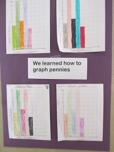
Next we looked at the information/data we could record from a handful of pennies. First we created a table, recording the year the penny was minted and the number of pennies in that set. We used tallies to help us keep track. Then we created another bar graph to show this information.
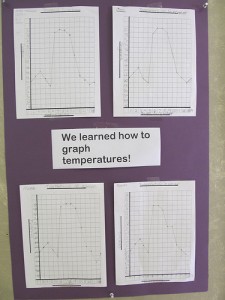
Now it was time to learn about line graphs. Here we looked at a table showing the change in temperatures in a single month. The zig zag of our line graph showed how the temperature increased and decreased, day by day.

